
A design direction that gives the brand room to speak
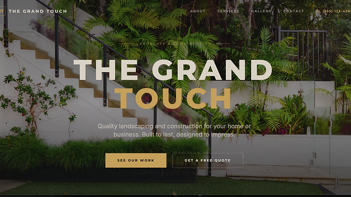
Landscape and construction work often needs both visual presence and clear organization. The preview starts with a centered serif hero to give The Grand Touch a more intentional, composed opening. Gold accents are used as a supporting detail rather than a distraction, helping key actions and visual boundaries stand out. This direction was chosen to create a distinct brand identity for the concept while keeping the page readable for someone who is trying to understand the business, the type of work it handles, and how to ask for a quote.